
Lip Sync Project
Ideas and Development
Much as I might stress about keeping up with the workload of the course, I can't help looking forward to projects like this - my first time attempting spoken dialogue in animation.
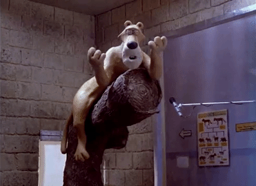
At the end of our first session introducing the project, we watched Nick Park's original Creature Comforts short (1989). The film famously used conversations with the public reimagined as interviews with zoo animals, serving as a good example for us of how to bring life to existing audio clips in creative ways.
It's deeply nostalgic to me to revisit this as Nick Park was my childhood hero, and the Aardman Classics DVD was instrumental in making me want to be an animator as a boy. The way Nick Park brings varied, funny performances out of plasticine still inspires me, and I hope to find a similar spirit when working with digital drawing.
Creature Comforts
I found this behind-the-scenes video useful, showing the process of animating the Creature Comforts series. It breaks down the choices according to different characters, adapting naturalistic dialogue. Although I won't be doing stop-motion this time, all the principles apply.
Choosing a clip
Firstly, here's a couple of sketches when I was deciding on a clip to use. I won't go in either direction now but I like to keep a record of what could have worked.

Pompous George Sanders type, talking down to a young woman.
I imagined a restaurant, and various animals in smart dress. The example here is a wildebeest and flamingo, the wildebeest looking down his long face/nose at the young bird.
Clip from 'Misery'. I thought it would be fun to have a granddaughter raging at her grandfather, looking for answers about her melted snowman. Similarly to above, I was looking for a contrast in size of characters.

From a list of about twenty audio clips, I whittled my choices down to a shortlist and finally arrived at one: this 10-second excerpt from 'Charlie and the Chocolate Factory'. The original context of the clip doesn't matter, in fact it's best to get far away from it to stretch my imagination.
I chose this as a I wanted something that has a sense of humour, and that would work as a complete scene, even at just 10 seconds long. Listening to the interaction of these characters, I could tell it would be rich in opportunities to play with performance. With one of the three oblivious to what the other two had been talking about, I can see in my mind's eye how each of their reactions could sell the moment.
Initial ideas
Reacting to the audio clip chosen, here's my mind map of possible routes to go with it.

I have chosen to make a trio of frogs. The clearest reason for this is the final line, "dragonflies", which suggests a swamp/pond setting. We're getting into this project pretty quickly so I won't have time to explore other options. Maybe that's for the best, often I will explore every possibility before just picking one that would work well enough.
Below is my first moodboard of art influences that come to mind when thinking about drawing frogs - some obvious ones, some less so. I want to exaggerate the forms so I have looked to caricaturists like Ronald Searle and Gerald Scarfe whose illustrations can push into the grotesque. Using animal characters allows me to really stretch the design. I may go fully cartoony but it's nice to keep some sense of real anatomy to really sell it.
One of the reasons I am picking frogs is the challenge of how to depict the bulbous eyes. My typical style is usually to show the eyes as dots, and that's basically impossible to do with a frog design.

This second moodboard is a deeper dive on Ronald Searle, studying his distinct style. I want to be similarly playful in the shapes of my frogs, and get some of that hand-drawn texture in the spirit of my final animation.


Needless to say, I am studying real pictures of frogs to put my preparatory sketches together. It's always useful to go the original source i.e. true frog anatomy, and then go wild with it.
The following sketchbook pages are working towards the three final character designs.


Sculptures

Right: A clay sculpture of Sulley from the pre-production of Monsters, Inc. The concept art at Pixar is always inspiring to me, and it has shown me how exploring ideas in various media helps to build towards the final design.
Ahead of drawing character turnarounds, I want to have some three-dimensional models to use as reference. I might be giving myself needless work to do here, but I reckon in the long run I will be glad to have all angles of the frogs to refer to. I need to familiarise myself with frog body shapes, and it's easier for me to comprehend in 3D.

During sculpting - using Super Sculpey, first introduced to me in last year's puppet project.


I have previous experience working with air-drying Das clay, but it was always frustrating as it would react to the heat of my hands and start hardening if not carefully protected. Working with Super Sculpey is so much easier, and it makes me look forward to sculpting for all future projects. These models are were baked in the oven on a low heat, the timing of which I'm still getting used to.
For the poses here, I wanted to find the quintessential expression and body language for each character. For this lip sync project, I imagine I won't be needing to do full body movements, concentrating more on the subtle actions of the head and face.


Turnarounds

Having the clay models clearly helped me here to construct these character turnarounds, mainly helping on the complex angles but also adding to a convincing sense of weight/balance. There is however an extra level of characterisation I can bring to these drawings that I couldn't get in sculpture, as linework can emphasise subtle details. With the lines around the eyes, so many tiny expressions can be conveyed. Particularly for the middle green-turquoise frog, his expressions will be quite restrained so the lines around his eyelids will need to be exact and remain understated. I am less concerned about the broader facial actions of the other two, and their designs are quite exaggerated - hopefully this means I can play more with their facial movements without worrying about strictly staying on-model.

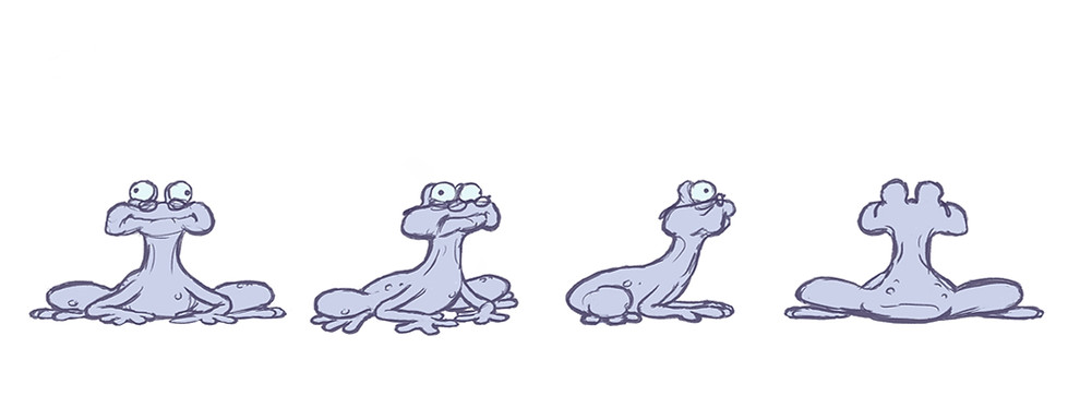

A final addition I made to these designs was to add glasses to the last frog, a suggestion from one of my tutors. It does help to signify that this is the elderly one of the bunch, and I already have one human element with the other two: lipstick/eyelashes for the first, and a cup of tea for the second.
As for colour, I went for an analogous colour palette, going from a cool pink to muted blue to turquoise. Given the sneering, self-satisfied nature of the first two frogs, I think it makes sense to make the colour feel tasteful; pastel rather than earthy or a vibrant green (how vulgar). This is also reflected in the coloured lines, which lend a gentle softness unlike my typical choice of black.
Considering line quality, I want to keep some fresh sketchiness juxtaposed with the flat colour of the body. It's easy to make the whole thing look flat and somewhat digitised, so I like the organic, human element that comes across in unpolished lines. Here are some examples of Toulouse-Lautrec's lithographs, where I feel that looseness is on best display. I love where there is a rough spontaneity and wonky misaligning/skipping of lines, never compromising our understanding of the overall forms. I'm curious to see how this might translate to animation, particularly with the more sophisticated tools available in TVPaint. However I will need to be wary of when inconsistent lines may cause unwanted movement.

Character poses


Once I settled on the final designs, I sketched out these various poses ahead of the animation. It's essential to familiarise myself with the shapes and expressions of these characters as much as possible. It has always been a struggle for me to draw characters consistently, so I need all the practice I can get. It is easier though with the more extreme designs to stay vaguely on model.
Sketching these poses feels akin to an actor first getting into character, testing the waters of how far to go either in hamming it up or having some restraint.
Storyboards

Here are the rough preparatory storyboards for my scene. With some of these close-ups I can really get into the expressions, and I think there's enough of a variety of shots to keep it moving.
Continued on next blog:
