
Graphic Novel
Continued from previous blog:

Part of the first character design lecture addressed the notion that characters are inseparable from the world and story they inhabit. During the initial stages of developing my character, Zub, I was also starting to establish the story he existed in. There's a lot of overlap here - see previous blog for earlier sketchbook pages.
More sketchbooking
I love this part - just getting any and all ideas scribbled down as they come to me. Often I'm just trying to make myself laugh but truly that usually sparks off story ideas at the same time. Sometimes it's as a doodle, other times as the written word. It's this combination that always brings me back to comics as the thing that brings me most joy and what I most want to spend my life making.
Ideally, I want to join the tradition of The Beano in creating regular comics for kids/all ages, with bumper annual specials. Graphic novels for adults leave me kind of cold; sophisticated they may be but rarely funny, in my experience. I have little interest in seeming to be clever in what I do, rather I want to aim to entertain, which leads me to find sillier ideas that appeal to my inner child.


At this point I am gathering together any moments that will feature in the four-page graphic novel excerpt. I need to experiment with page layouts and find dynamic and most importantly clear ways to communicate my scenes.
'Cursed': The Full Story

Although the brief for this graphic novel project asks only for a four-page section, I found myself fleshing out the larger themes of a full-length story. I'm finding that it is necessary to know the finishing point of the feature-length narrative just to know which pieces need to be in place at the very beginning.
Overall synopsis:
A mysterious curse awakens Zub, an ancient Egyptian jester, now mummified and entombed in a modern-day museum. In his previous life, Zub was once the prized comedian of Huzzah the pharaoh, but a misplaced joke at the king quickly sealed Zub’s fate. Uncomfortably reanimated as a walking corpse, Zub is unable to die, unable to belong in the new world. With nothing but an endless, absurd life in store, he seeks only the path to a peaceful afterlife. But what Zub saw as a vengeful spell from his pharaoh is not quite as it seems. Huzzah deeply regrets his actions, leaving Zub a means of reaching eternal sleep, finally connecting as friends thousands of years apart.
After developing several disparate moments, I really started pulling together all the pieces as a more cohesive story on the page below. I have come to realise I actually take more pleasure in writing than drawing, particularly at times like this when it feels like the story gains a life of its own. Once I understood the motivations of Zub and Huzzah, every part of the plot seemed suddenly obvious to me. I scribbled this all down on a short train journey, trying to get all the story beats on paper as quick as I could in case I forgot any of it.


The bare bones of a jester-pharaoh relationship were explored early on, and I soon arrived at the idea that the jester would be punished for a joke at the king's expense. At the time there was a lot in the news about President Trump trying to cancel another of his late-night critics, so a cartoonish villain with a thin skin seemed to fit what I was after. But as I continued to explore the motivations of my main two characters, I found it would be interesting if there was something deeper behind the conflict. A sadness behind the pharaoh's actions that spoke to a feeling of heartfelt disappointment, i.e. a missed opportunity at true friendship. It's easy to assume the powerful and wealthy pharaoh is just lording it over his citizens and to lazily disregard the possibility that he has a heart at all. Of course acting rashly in having his jester killed, but then haunted by it enough to find a way to revive him after death.
I like exploring the pettiness of both main characters when thinking the worst of each other, and finding an unlikely path to understanding each other.
Inspiration from comics

Frank Miller's Daredevil
I have been delving back into my comics collection, looking for effective ways of communicating my chosen moments across four pages. Though it has been a long time since I regularly read comic books, there are certain examples that stuck with me as go-to masters to study from.
Featured here are some select pages that I am referencing as I construct my graphic novel project. I could go on endlessly about comic artists, but these scans are the ones that stand out most in relation to my scenes.


Batman: Hush. (Writer- Jeph Loeb, Penciller- Jim Lee, Inker- Scott Williams, Colourist- Alex Sinclair)
The page above is an example of what I will be aiming for with the contrast of modern-day museum setting and a nostalgic look back at the golden years, Egypt in my case. The bleak scene of Batman and Joker fighting in an alley is shown in the stark visual language of harsh black lines and digital colouring, used for most of the book. When looking to the past, however, the characters are treated with a softer, painterly style, suggesting the haze of memory. The colour plays a part too, with a cool night blue versus a sunny, happier palette.
The montage continues on the next page, as Batman remembers Batgirl in her prime. Again, the visual treatment is creative and playful, with the watercolour still keeping us in the past. With my flashbacks to Egypt, I might be able to take more liberties jumping to different scenes, whereas the present day needs to be more moment-to-moment.

The Amazing Spider-Man: Happy Birthday
(Writer- J Michael Straczynski, Penciller- John Romita Jr., Inker- Scott Hanna, Colourist- Avalon)
Excerpts from my favourite run of Spider-man comics. At a young age I could feel the strong impact of certain moments, though I'm not sure if I could say why at the time. Revisiting these pages, I think there's a great momentum built in the timing of the panels, for maximum impact on the hit. The way Romita draws the figure is very expressive and I can really feel the weight or elasticity of Spider-man through his poses.

I'm looking at this particular issue as my museum scene has a similar motif, with my mummy character waking in darkness. In the context of Spider-man here, he is being pulled into an astral space and reliving countless previous battles, taking a toll on him physically and emotionally. I'm paying attention to the spacing of panels to convey how heavy the experience is weighing on him. The bigger panels clearly have a greater emotional emphasis. One of the extra appeals of Spider-man is his humour and the comic timing of his responses to any ordeal, always lending a true sense of humanity.


Daredevil #172
(Writer/Penciller- Frank Miller, Inker- Klaus Janson, Colourist- Glynis Wein)
Frank Miller is my go-to reference for creative panel design. His layouts were my introduction to incredibly varied shapes for panels, often stretched tall or wide and keeping a dynamic energy going through the story. The danger is making more a cramped page, but it is really effective particularly when claustrophobia is part of the intention i.e. Daredevil crawling through a water pipe, below.

With my characters in mind, I'm looking at the presence of Kingpin here as a parallel to my pharaoh. Being physically the largest character in the story and wielding most power, he looms over both the events and the space of any panel he appears in.
Also, it's interesting to see the silhouetted action here, considering how little background there is. We get a sense of the environment without much visual information, and it is removed entirely with a blank background to close out the sequence. My assumption can often be that more details is better for the reader, but clearly here that is not the case. Since I will be drawing a museum full of background features, I need to be careful in how I depict it without cluttering the page.
Additional research

Moodboard 1:
This first moodboard focuses on Egyptian art and miscellaneous art influences which I think would be useful to keep in mind as I draw my mummy in action. I have already designed the character but here I am also thinking about the rigidity of his skeletal limbs as he walks.

Moodboard 2:
Featuring the two main settings I will be drawing: a museum at night and a pharaoh's court in Egypt.


To further familiarise myself with the environment of my comic panels, I revisited The Fitzwilliam Museum in Cambridge as they are currently hosting the Made in Ancient Egypt exhibition. My previous museum sketches (shown in character design blog) were from the main permanent collection, whereas these artefacts form a temporary show - fortunate timing for working on this project!
I will be incorporating similar background details in my museum scenes. Though these objects may not be prominent features, they should all add to the texture of the scene.
Sketchbook roughs
The following sketchbook pages explore small thumbnail versions of what will appear in the final four-page section. The brief asks for an inciting incident, and so my pages will be something akin to a 'Chapter One' of the larger graphic novel story.
Zub wakes up in the museum, thinking he's just been asleep for a long time. He staggers around, realises he's dead and memories flood back from his past in Egypt. We see his performing as the pharaoh's jester, then being punished for making a joke at his boss. Zub confronts the pharaoh's sarcophagus and sets off the museum's alarms.


Reaction poses.
These three drawings are intended as practice for moments to be included in the story. Whether or not the final poses will be the same, it is helpful to get more used to the Zub's personality and physicality.
Over pencil sketches I used a brush pen and a fine liner. The varied width of line has a nice aesthetic quality and could be a good way to make the figure stand out against a cluttered background on the comic page.
I started to think I had misread or misheard the brief by writing the start of a longer story, and not a self-contained four-page short story. I mention this as the next sketchbook pages were trying out a short story alternative, but also to examine my lack of confidence in dealing with a brief. It's a very different experience working on my own self-generated projects versus a task set for me. I find it hard not to stress about the quality of my writing and illustration when I am needing to fit requirements I didn't set, just in case I have misunderstood them.
Something about this project makes me feel more insecure than usual in sharing my ideas, since I do love working on comics so much. I have kept so many of my stories private, however, so I still hold a lot of doubt about how my writing will be received on the outside world, particularly if I'm hoping people will share my sense of humour.
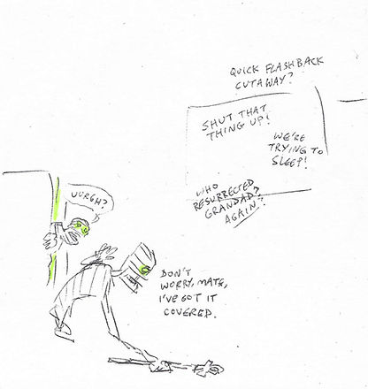

The idea for this short involved security guards installing a magic Egyptian ankh in the museum which awakens Zub, already present in his coffin. Zub reacts to the ankh as an unwelcome alarm clock ringing, and stumbles around looking for a spell to switch off the magic and go back to bed. Eventually he finds the hieroglyphs on his own sarcophagus and reads the magic words aloud, 'water, scarab, budgie, pyramid' etc. He climbs back inside his coffin and one of the security guard returns, baffled by the clumsy mess the mummy left behind.

Although I won't be making this version, I am repurposing the page above as the first page of the larger story. It feels like a clearer inciting incident to see Zub wake, rather than just experience it from his point of view in the dark.

Colour tests
I'm testing a couple of different approaches to the Egypt flashback scenes. As it's Zub's recollection of events, it seems more appropriate to be experimental here than with the present-day scenes which should stay more consistent and grounded.

The coloured pencil sketches above explore a memory of Zub's heyday as if depicted in Egyptian art. First as if cast in gold, and secondly as a relief mural in stone, aged like a museum piece. The linework in the final pages should have this softness/lightness to it, in contrast to what will be black lines in the museum scene.
Incidentally I feel like this image really sums up the dynamic between Zub and Huzzah. The pharaoh squeezes his jester like a spoilt kid and with a strong grip - suggestive of his stronghold on Zub's life. Zub himself is happy enough to please his master but uncomfortable as he doesn't necessary have warm feelings towards Huzzah at this point in the story.
Another option was this final sketch in a looser style. I wanted to try something in full garish colour, as if a birthday party for the giddy king. The watery splashes also have that child-like quality of joyous times past.


First draft


These are my first roughs for the final version. Having everything in place at this stage made it easier not just for me to review, but also I could get the advice of others on how it would read to someone unfamiliar with the characters. I jotted down some amendments after talking it through with my tutor, mainly to create a better flow in the pacing and structure of the panels.

I thought this project would be a good opportunity to learn more about drawing on Photoshop. I may always have mixed feelings about digital drawing but I have been discovering more digital paintings which have an organic feeling, so it might be a matter of finding the right tools. This time I am using a 'charcoal pencil' brush, which displays many of the qualities I look for in linework.

One artist I have been following recently is animation director Aaron Blaise. He is best known for his drawings/animations of animals, working on several of the Disney renaissance movies and co-directing Brother Bear. Being self-taught, I am keen these days to pay attention to the tools used by professionals in the illustration or animation industry. Blaise always uses Photoshop for drawing (and TVPaint for his animation work). There will often be an overlap of these processes i.e. draw a background in Photoshop and import to After Effects and TVPaint.
This sketch of a lioness is a good example of using tools that mimic traditional pencils and brushes, giving some of the texture I feel is absent in a lot of digital work. It may just be personal taste but I need to see some grit or else the digital sheen leaves me cold.
Finished pages
There were several elements I was trying to juggle to bring it all together - lighting, texture, pacing, text, line quality, colour. With each part I sometimes felt that I was giving myself too much to do, particularly as this project would eat into the time I needed to spend on others. But I wanted this to work as a finished piece as proof to myself of how I would treat a more professional assignment.
Paying attention to the balance of where the eye is drawn is the key exercise here, it seemed. I knew I wanted the museum setting which gave the challenge of how not to over-complicate the background with additional details. I played with opacity, lack of colour and blurred/sketchy lines to suggest the setting rather than make it the main attraction. Weight of line for the character poses was also an important thing to consider, with the heavy black line really shaping the emphasis of the scenes. Clarity is a difficult thing to achieve, and the more objects there are in the frame, the more I had to remind myself of what I want the reader to be looking at - I hope the end result has the flow I was looking for.


Final thoughts
It has been quite a significant project for me to test out something close to what I want to do after the course is finished - writing and illustrating full page comics. Although I have known that's what I want to do for a long time now, I always struggled to finish anything. I'm truly my own worst critic and so I tend to be critical of my work to the point of not following through on what I consider imperfect. Having a deadline meant I had to turn in something though, and I'm happy with what I ended up with. I can see how the years of trial and error have helped me become a better illustrator and storyteller, and at the very least I am sharing my stories with others, which I was very reluctant to do in my early twenties.

Here's an example of something I was working on when I was 22. Featuring my childhood comic characters, Fridge & Fly, I wrote countless stories as feature-length adventures for them (still my main passion). However I kept hitting a wall of perfectionism - what I felt was the reality of it not being ready and never believing enough in myself to be out in the world promoting it.
I worked on paper with pencil, charcoal and ink. All my heroes worked in traditional media, so even if it had occurred to me to work digitally, I would have responded with a stubborn rejection of new methods and frankly I never liked how digital art looked. This meant that I would inevitably make mistakes that I couldn't really erase and I would start again several times. Kind of mad, but I must have been learning something.
The digital tools I now use (though only the last couple of years) are far superior for ease of production, and there are means of replicating certain grainy textures that I am still testing. It's exciting to know what's possible, and I can't wait to have another go at a full page story over Christmas!

When I was working on the four-page graphic novel project, I tried to keep the tone light-hearted and irreverent, thinking about aiming it towards a younger audience. I was reminded of the Horrible Histories illustrations, which often dealt with horrific details of past events with a gallows humour that kids appreciate as they're not being talked down to.

'The Barmy British Empire', 2002 - Illustrated by Martin Brown

Finally, it all comes back to The Beano. Despite all my explorations of the fine art world and graphic novels for adults, I still crave the brevity and silliness of these short comics. Here's an example by one of my favourite Beano artists, Mike Pearse. I find his work incredibly visually appealing, always giving the perfect amount of character expression and conveying a joy of drawing with the deftness of a painter. Even the sense of hand-lettering is exactly what I prefer, hence how I tackled the speechbubbles in my pages. There's always the danger of a wonkiness when I draw letters or anything by hand, but I like the definite human feeling that comes through.
