
Client Project
Pitch

In the first week of the live client project, we were introduced to Meghana Rao Nadendla, who presented us with the brief. Meghana showed us the intended goals behind the PRIDaLLY app, and what to aim for when producing our group animations to promote the service.
At this early stage, I needed to familiarise myself with the online materials for PRIDaLLY and start to form my own pitch for the animation. In particular, I am keeping in mind the central problem and solution to be conveyed in our piece. My group is addressing one aspect of the LGBTQIA+ friendly app: the 'Queer Affirmative Drug Bank'. In my case, I have been asked to view this from the perspective of the practioner i.e. 'A pharmacist uses PRIDaLLY to check drug interactions specific to transitioning patients and shares affirming information'.


I took some screenshots from one of the sites giving an overview of PRIDaLLY. Some of this can feel quite dry, but that makes it a worthwhile challenge to find what illustrators/animators can add to the subject. I want to bring something of a playful children's book style to my pitch, so the ad might feel friendly and less information-heavy. The experience of using the app should be evident in the silent animated action rather than overexplaining everything - this is just an introductory 30 second film.
Style inspirations

In response to the brief, I made a note of certain design aspects that came to mind.
There is a definite theme of colourful characters in all the existing material for the app: the app mascot is a purple caterpillar/butterfly, and the logo's pride colours show the whole rainbow.
Part of the brief asks to 'reflect intersectional identities — diversity in gender, race, age, disability, neurodiversity, and body types'. This led me to look at Roger Hargreaves' Mr. Men books, as a universal illustration of different types of people, without the possible alienating effect of being too specific to one demographic. It is possible when looking at a bright purple blob, for instance, to feel like it represents all of us.
Looking forward to the collaboration with other animation students, I want to be sure I'm creating a visual language that can stay consistent, whoever is drawing the scenes. It's not a question of drawing ability, but the inevitable personal touch of how each one of us naturally draws. So I looked at Bob Godfrey, probably best known for the Roobarb cartoons, for a deliberate wonkiness that doesn't compromise on charm and clear design. Many of my references here use a white/stark background, and it often enhances the cosy effect, evoking something of kids' drawings.
Also, I looked at contemporary styles, i.e. vector-based graphic animations like Hey Duggee. Less to my personal taste, but it's much more common in the industry today to have a clean, crisp image, unlike the marker-pen wobbliness of Bob Godfrey. It might also be more suitable to create shapes in this vector style, so that the characters could be 'rigged' consistently with each of us, as we figure out how to work in tandem.

LiLo, the app mascot.


Sketches and Pitch

It has been quite a fast turnaround from first being introduced to the brief to submitting a pitch idea. With just a couple of days to work with, I needed to get ideas down on paper quickly and just go with what was working.
Here are my rough thumbnails starting to form around the metamorphosis/flying animal idea.

I hoped to create a scene between customer and pharmacist that feels very simple and somewhat self-explanatory.
The body language and expressions of the two main characters would lead the scene, with a customer starting out nervous and leaving with a reassured demeanour.
I wanted to make sure my storyboards were clear enough for the client to comprehend without too much difficulty, so I sketched out these digital full-colour drawings as part of my pitch, alongside a brief synopsis:
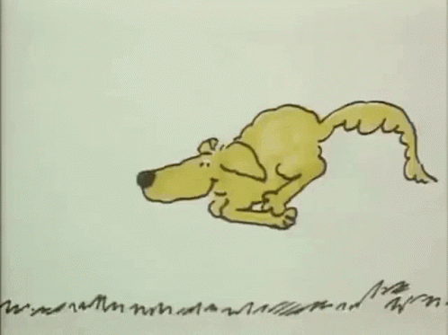
Happy Metamorphosis!
A nervous cat sidles up to a pharmacy, unsure of how accommodating the pharmacist might be to their needs. The pharmacist (dog) gives a friendly wave, and so the cat approaches the desk. The cat shows the pharmacist their phone with details of their medication, and the pharmacist reassuringly shows his own phone ready with information from the PRIDaLLY app. The cat receives the right drugs, feeling free to spread their butterfly-like wings and fly happily away. Other flying animals inhabit the sky, sharing in a joyous community.


I finished off the pitch PDF package by including these brush pen sketches. First, this initial page of the flying animals, which inspired the overall piece. I was thinking a little of Quentin Blake in the looseness and joy of drawing.
And finally, I added the simple character portraits below.


I thought that a dog would be the friendliest face in the animal kingdom, and the cat works as a character who might usually be reluctant to trust a dog. This would be in the subtext though - I mainly wanted to have appealing faces that aren't too distracting from the main message.
Client's choices
This week we began working in our assigned groups - mine includes Risha, Ruby, Maria, Audy and Alfie. A mix of classmates I have started to become more friendly with but in most cases we still know very little about each other.
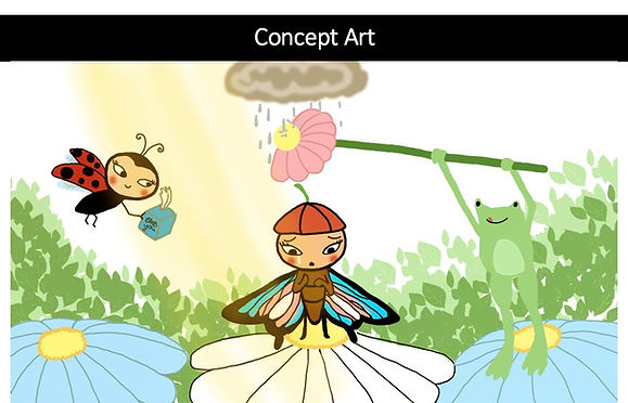
The client chose a combination of my overall idea/aesthetic, but with the character designed by Ruby. Her sketches are shown here, as I was then tasked with redesigning the butterfly character to fit the flying animal moment in my original scene.

Clearly, Ruby's natural sense of design is quite different from my own, and I have struggled to know the right balance of being true to her drawing but closer to my own sensibility. I love the elegant, stylised simplicity of Ruby's round bug designs, particularly in the pencil sketches.

I soon felt the pressure to provide a clear creative direction to go in. Time is very short on this project, and I needed to quickly develop a turnaround for a new character, based on Ruby's. Normally I take longer to refine a design but we really need to get to animating straight away so I handed off what I could as soon as possible.


If I were designing my own insect/butterfly, I would study nature first and then cartoonify it. Ruby's design is more humanoid than I might have imagined, so I looked for extra clues to show this is an insect - mainly the segmented parts and purple hue reminiscent of A Bug's Life.
Bugs are weird up close, so there always needs to be a balance of anthropomorphism to depicting them as friendly and not alien characters. I reinterpreted the long coat of the cat from earlier as folded-down wings here - making use of real insect anatomy in a familiar human style.
Fleischer Studios' 'Mr. Bug Goes to Town' (1941) - I only recently discovered this classic feature, and it came to mind as an effective example of very human-like insect characters.

When discussing the redesign for the pharmacist, Audy suggested that the frog featured in Ruby's sketch would be a natural parallel to the dog versus the cat, as initially an insect would be wary of a frog. Like the previous pharmacist design, I just wanted to make the friendliest face I could here. I presented the team with these few poses as there would be no other angles needed for the shots we had, and again, we just needed to get going.

Here are some character sketches by Audy from day one, as we were figuring out how to bridge my idea and Ruby's characters.
It's a very rare thing in my life to genuinely collaborate on a creative project, though often I have wanted to. Even if this is a bit of an awkward brief, it's exciting to see the work of my teammates come to life.
Selecting shots
Still on day one of the group project, I redrew my pitch storyboards with the new character designs so that each shot could be assigned. We discussed the new environment too, with some swamp/forest elements like giant flowers or toadstools to fit the redesigned animals. On an Excel spreadsheet, I categorised the shots according to difficulty, and everyone picked something to start working on.


Shot 1. Butterfly enters scene (Audy)

Shot 2. Butterfly approaches desk (Joe)

Shot 3. Holding up phones (Ruby)

Shot 4. Happier face (Ruby)
--transition into--
Shot 5. PRIDalLY app graphics (Risha)


Shot 6. Handing over bag (Risha)

Shot 7/8. Thanks, fly off... (Maria)

Shot 7/8. Thanks, fly off... (Maria)

Shot 9. Community scene (Everyone)

Responsibilities on these shots may be swapped around if needs be. Shot 7/8 was something I originally volunteered to do as it is the same composition as shot 2. It soon became apparent that it was too much for me to take on. Having the managerial role takes a certain amount of time and energy, on top of animating my own shot.
Shot 10. Logo
Initial Animatic
This was assembled by Risha to get a sense of the timing of our shots. Risha also found the music and sounds for this animatic.
Backgrounds

Maria volunteered to work on backgrounds, and this was her first concept based on the aesthetic of my pitch. I suggested a painterly wash and loose line look.
I also requested separate PNG assets for parts of the set, in case we needed to assemble the background/foreground elements later down the line on After Effects. Here are just a few of them.


.png)

This might be the most physically and mentally exhausted I have felt so far on the course. It's an entirely different pressure to have colleagues waiting on you to hand off instructions than it is to work alone. Thankfully, I think I have a good group of diligent, creative people so I might not have to do everything myself (as can often be my only option).
