
Motion Graphics
The brief for this motion graphics project involves creating a conceptual trailer for a book. I realise this will challenge much of my natural inclination to make a character-driven conventional narrative; this time I will need to think in more abstract terms. Motion graphics and graphic design in general is something I admire but rarely dabble in myself.

Selected Saul Bass title sequences through the decades
For our introductory presentation we were shown Saul Bass' legendary film title sequences as an example how to approach this - finding the essence of the story in symbolic images. As a film fan, specifically a Hitchcock fan, I am familiar with Saul Bass' work and I'm excited to explore the bold graphic aesthetics that he is synonymous with. Revisiting these sequences, I am struck by the simplicity of the ideas on show. I need to keep this mind with my own work, as I can tend to overcomplicate things rather than being brave enough to make the simplest statement possible.
'America' by Jean Baudrillard
For my book trailer, I chose 'America' by the French philosopher Jean Baudrillard. It is something of a travelogue, painting a complex and poetic portrait of the US in the 1980s.
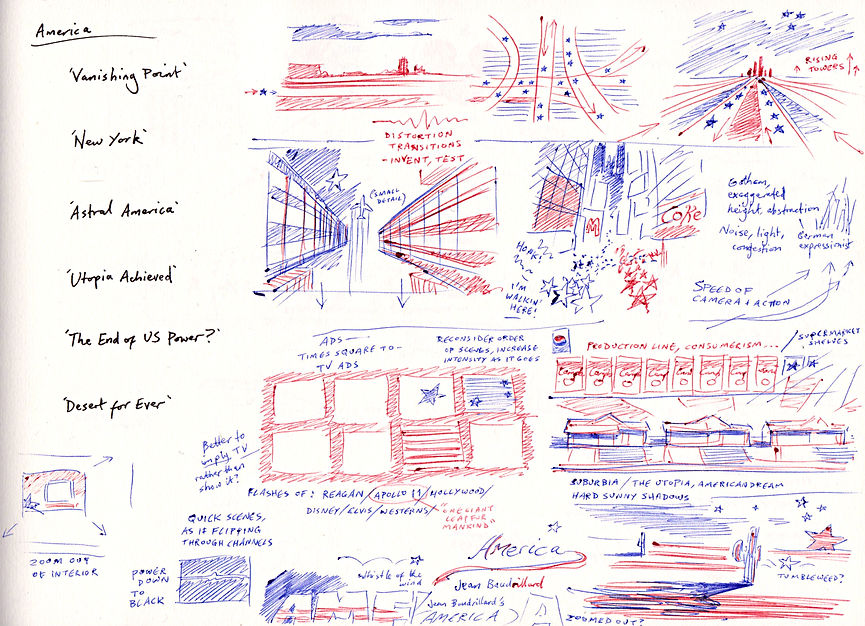
Below is my initial mind map based on my knowledge of the book at an early stage. I had been reading excerpts on the train but not yet finished the whole thing.


The sketchbook is where I can get any and all ideas down, not knowing which will be the main theme going forward. Much as I might have an idea in mind to begin with, continuing to draw alternatives helps to shake up stale instincts and make unlikely connections.
I found myself really struggling to think less like an illustrator and more like a graphic designer. My natural inclination is to be literal and representational, but that isn't always the most effective way to go. This project is challenging me to remove inessential visual information to make a stronger image. For instance, I asked myself the question 'if I want to show a car journey, do I need to actually see the car?' There are so many ways that the motion itself can communicate the journey. Similarly, I thought about a TV screen changing channels, but that motif can be realised without showing the TV set.

It was exciting to realise what movement alone can communicate, being so used to the still image. I contemplated showing shapes passing by the camera, like lights passing by at night. No horizon, no cars, but our minds would put the pieces together - particularly when paired with sound design.
Here I am starting to combine various ideas. Originally I thought the tuning of a car radio made sense because it's what Baudrillard was hearing on his journey - later this changed to the TV channel hopping effect, more contemporary to the 1980s. Increasingly I find myself understanding how I am free to make lateral connections without confusing the viewer.


Reading the book
'America' is very dense with observations on all aspects of American culture, landscape and history. I am making selective notes on certain quotes that may jump out as visual cues, so I can distill down the broad themes for my graphic art.
The quotes I'm keeping for my own reference and take up a lot of space, so I'll link to that page here:
Visual research
To start off with, I'm taking notice of the pictures present in the book already. Baudrillard would have signed off on their inclusion so they are a useful steer on the tone of imagery I might use. I don't necessarily intend to use the same subject matter, but doing the obvious may not be the worst idea in the context of this brief.
The feeling I get from these photos is an emotional distance, a sparseness that reflects the outsider's perspective. Looking at, rather than being in the landscape.

Chris Richardson (Frontispiece)

Chris Richardson: Vanishing point

Elliot Erwitt: Astral America

Diana Walker: The end of US power?

Raymond Depardon: New York

Chris Richardson: Utopia achieved
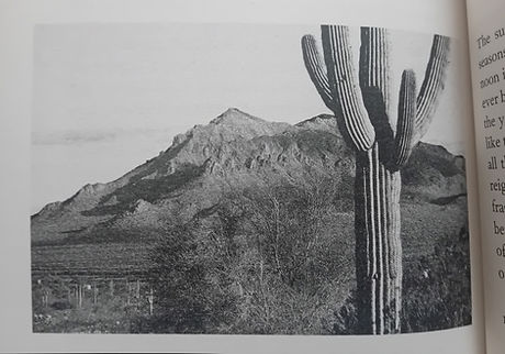
Chris Richardson: Desert for ever
Again, to find the imagery already approved for the book, I looked for as many covers as I could find. Varied as these are, it's interesting to see how they tend to land on a couple of main settings: the desert and Manhattan.


Moodboard 1: Certain images came to mind from my years of fine art and love of movies. I was thinking of artists who depicted America from a less obvious (or just non-native) perspective. Featured here are David Hockney's painting and photocollage, Ed Ruscha's panoramic pop art, Michelangelo Antonioni's Zabriskie Point (filmed at Death Valley) and Wim Wenders' Paris, Texas.

Moodboard 2: Koyaanisqatsi directed by Godfrey Reggio (1982), a non-narrative documentary film. I thought this would be a good case study to revisit, as it takes a similar overview of the US in the '80s. There is a common emphasis on the speed of change, giving the viewer space to contemplate the vastness and strangeness of modern America. Without any additional commentary, it's a useful lesson in silent cinema and abstract film-making, putting me in the right headspace for motion graphics.

Finding my motif
From my first sketchbook doodles, I had a lot of ideas I thought were almost good enough, but not quite. Everything felt just too over-complicated and lacking a memorable visual signature.
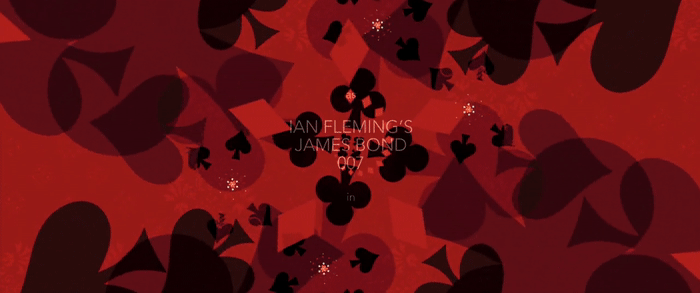
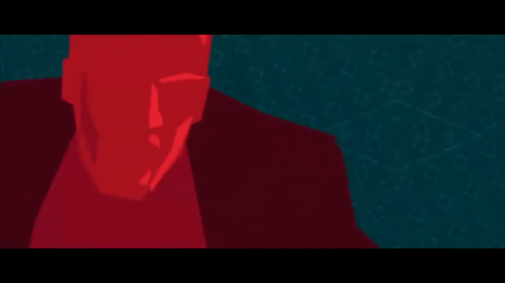
I looked again to examples of motion graphics which I think work really well, like Saul Bass' designs. Here are a couple of clips from the opening titles of Casino Royale (2006), where the motif is playing cards and the recurring shapes of the suits. It is this kind of simple motif that has been missing in my sketches. I keep slipping back to just drawing things as they are, when I could reinvent the whole visual language.

The Catch Me If You Can (2006) titles were a helpful guide on how to show changing environments without losing a consistency of vision. The recurring lines which flow into the next scenes help to keep the whole piece fluid and appealing. I rarely make anything as flat/vector-based as this but I can see how it adds a level of clarity.

An important reference for me was this little introduction to UPA's 'The Jaywalker' (1956), which presents busy traffic in abstract shapes alone. Nothing is lost in the communication of the cars, if anything it is more effective. I spent many train journeys on my commute watching a playlist of Oscar-nominated animated shorts all throughout the 20th century. You never know what might stick, this ended up being instrumental for me to think in more abstract terms.

Mondrian's Broadway Boogie Woogie (1940) painting also helped to demonstrate a different portrayal of life in action. Without showing buildings, people, streetlights or cars, we can feel the sense of an active city. I found an animated version of the painting on Youtube which stays true to that idea. Sometimes I wonder which of the great artists of the past would have experimented in animation had they had the opportunity.
Finally, I am looking at pop art as a particularly American visual style to keep in mind. Lichtenstein's Sunrise shows me how I don't need to use naturalistic colours or shapes to construct my landscapes. Lichtenstein used primary colours (plus black and white), and I have decided to use just three: red, white and blue.

Roy Lichtenstein - 'Sunrise', 1965


I had a vague sense of what I wanted, which could only be resolved by drawing, and more drawing. These iPad sketches were just exploratory trials, and at some point they evolved into a consistent look. It's funny how my hand can be ahead of my head in generating the best ideas.

I ended up not using this idea but this sketch of the desert landscape seemed to match up with the wavy line of a car radio, originally a possible motif for changing the landscape. I thought I could use the horizon line as a means of morphing the pieces of the American scenery, like the figures in this intro clip from Whose Line Is It Anyway.
Even if I like an idea, I have to ask myself if it conflicts with another, or if it just isn't working visually for some reason.


This is where I'm really getting a foothold on a motif. Starting in the desert, like the book, and crossing the American landscape as depicted as a land of stars and stripes. The stars mainly represent people or cars in motion, as I realised the animation can imply that travelling action.
Some of these concept sketches did end up being part of the final version. I could only get there by trial and error.


This original plan involved moving towards New York and the Times Square billboards, which would morph into TV screens showing increasingly fast cutting of images that represent America on the screens. The intention is to emphasise the growing relentlessness of the modern world, showing more moving elements in the busy city and TV network. The final shot returns to the quiet desert, to bring it full circle (like the final chapter of the book).


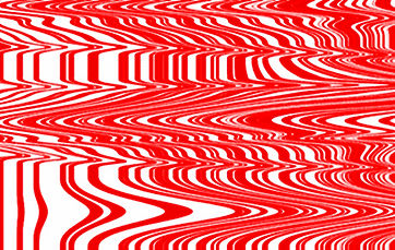


The transitions went through several iterations in my mind before I settled on the simple notion of TV channel-hopping. It seemed there was a commonality between the stripes of the flag and the warped lines of video.
I think it roots the trailer in the time period the book was written in. The '80s brought in a new age of countless TV channels and the increasingly short attention span that comes with that new technology.


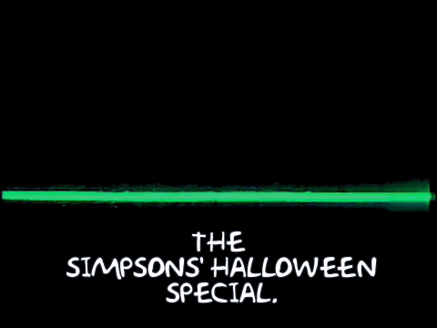
Considering the type for the title, I knew I wanted a contrast between the sensibility of Baudrillard (French, sophisticated thought) and an unsubtle, big fat AMERICA. The handwritten signature-esque name of Jean Baudrillard I hope implies a very personal authorship, which I intend to animate accordingly. AMERICA is all caps, and comparatively in-your-face. Also there is a timelessness in handwriting versus the type I will use for AMERICA which feels like it couldn't have come before the 20th century.
More sketchbook development
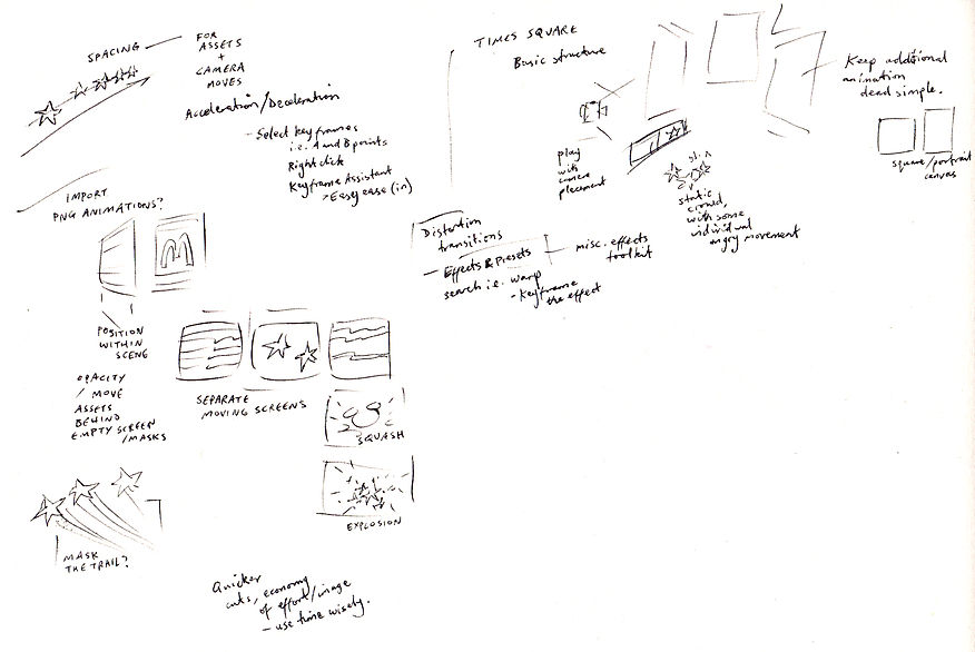
Over the course of the project, I continued to make notes to myself in my sketchbook. It's the most immediate way to test an idea and invite any alternatives before getting into the latter stages, and even then helping to reshape my plans as I face new challenges.
Featured here are a couple of versions of storyboards, first in loose thumbnails and later edited down to the final shots.


Animatic
I am glad I had the chance to go through this messy stage of animatic, testing the timing and structure of my trailer. Some of this looks a bit weird as I was experimenting with After Effects over the sketches I had at the time.
I do find it difficult to feel the speed or slowness of animation when I'm so close to it. Looking back on this, I can see that it is much slower in parts than intended. The intention was to start the video with a sense of space/contemplation and get faster and busier towards the city and TV screens. With this animatic, I ran well over the maximum 30 seconds in the brief so I knew I had to change the pace or cut something out.
Final version
Less is more.
That will probably be the main lesson for me after this project, as I ended up cutting many of the shots I planned. Usually I would view that as a failure of some sort, but there was definite purpose in keeping the momentum of the action involved. In this version I go straight from Times Square to the moon, cutting to the chase on the theme of 'one giant leap for mankind'. It meant I could continue the general idea of moving through a physical space rather than cutting to random imagery.
Rather than rushing to complete more shots, I could concentrate on improving the shots I did have - primarily the Times Square shot, which I hoped would feel dazzling in its visual noisiness. I could also tweak the pacing and timing of the handful of shots I did have, which made all the difference, clearly improving on the animatic. Incidentally, I found a video static transition on Premiere Pro which worked nicely for the TV effect I wanted - often I might see this as a cheat or kind of corny, but it seemed to work for these specific purposes. I'm trying to learn that cutting corners isn't a always a sign of a lack of effort and can show a way of working more intelligently to complete a project. After Effects itself cuts down on the time I might take to hand-animate a lot of the scenery, with automated timing and easing in/out.
Even if I don't do much with graphic design in the future, the familiarity I have gained with After Effects will definitely help me with other animation projects. I enjoyed figuring out how to create the illusion of depth with scale and position of PNG assets on a two-dimensional plane, and then three-dimensionally for the Times Square shot. When editing in post-production on future projects, being able to automate camera moves will be essential to creating more professional looking work.
It has been quite a rewarding experience working in more abstract terms, very much outside my comfort zone. Seeing things on an abstract level has helped me to see the value and meaning of movement i.e. camera moves, in such a way that I might miss with more conventional storytelling.